American Lookout Headlines receives compensation from affiliate partners for links on the site. Here's our complete list of Affiliate sites.
First Column 1
- Trump Reacts To Bill Barr Endorsement...
- ..."MAGA2024!"
- Trump Says He Will ‘Make A Play’ To Win New York In 2024 While He’s On Trial [Epoch]...
- ...“We Love Trump” Chants Breakout As President Trump Visits Construction Site
- Billionaire Hedge Fund Manager Says He Is Open To Voting For Trump...
- Chris Christie Gets Roasted After Saying Trump ‘Looks Terrible’...
- Trump Shares Latest Thoughts On NY Case, Makes Major Request...
- ...Trump Wants Appeals Court to ‘Take Over’ New York Case
- Legal Expert Rips Apart DA Alvin Bragg’s Charges Against Trump...
NR Only Headline
Advertisement
First Column 2
If you like American Lookout Headlines, please bookmark us in your browser.
First Column 3
First Column 4
First Column 5
First Column 6
"
Websites
- Gateway Pundit
- WLT Report
- The Epoch Times
- Conservative Brief
- Vigilant News
- 100 Percent Fed Up
- Trending Politics
- Big League Politics
- Freedom First Network
- New York Sun
- New York Post
- Right Side Broadcasting
- Conservative Treehouse
- People's Pundit Daily
- Zero Hedge
- Patriots.win
- Lucianne
- One America News Network
- Legal Insurrection
- Wayne Dupree
- Free Republic
- Intellectual Froglegs
- Western Journal
- Steve Bannon's War Room
Second Column 1
Second Column 2
Second Column 3
Get the American Lookout Headlines daily newsletter
Second Column 4
Second Column 5
Second Column 6
Telegram Accounts
Contact Us
Send Tips
Third Column 1
- Major Trade Union Endorses Biden [Epoch]...
- Left Wing Daily Show Mocks Joe Biden Over Cannibals Comments: ‘You’re Going To Lose The Election’...
- Pushing Biggest Tax Increase In Over 100 Years...
- ...Joe Biden LITERALLY Says The Quiet Part Out Loud
- Biden Accidentally Reads His Handler’s Notes Out Loud During Teleprompter Gaffe...
- ...Biden Tries To Dunk On Trump In Tampa And It Goes Horribly Wrong
- Kamala Harris’ Assigned Secret Service Agent Goes Rogue, ATTACKS Other Agents...
Third Column 2
Third Column 3
- US Economic Growth Slows To 1.6 Percent In 1st Quarter [Epoch]...
- Liberal Utopia: New California Law Could Terminate Up to 500,000 Jobs...
- Biden Backtracks On Earlier Promises, Makes INSANE Tax Proposal...
- With Lowest Oil Reserves Since '83 and Skyrocketing Prices, Will Biden Do the Unthinkable?
- Think 65 Is The Best Age For Social Security? Here’s Why You Should Rethink That Plan...
- ...The Downside Of Being A Single Retiree And How To Beat It
- Reaction to Biden's Economic Numbers: “Numbers made up”,“Someone's cooking the books”...
- Fight The IRS With First-Time Abatement...
- JPMorgan Chase CEO Dimon Fears US May Be Heading Back To 1970s’ Economic Woes...
Third Column 4
- California Gov. Gavin Newsom’s Dramatic Pro-Abortion Ad Targets Alabama [Epoch]...
- Biden Comes Under Fire for Invoking Jesus While Promoting Abortion...
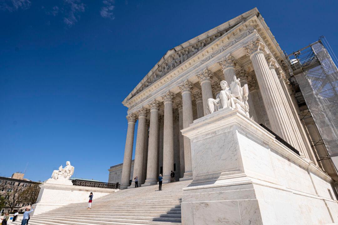
- Supreme Court Seems Sympathetic To Idaho’s Claim Its Strict Abortion Ban Is Valid [Epoch]...
- ...Biden Admin Seeks To Create Federal Right To Abortion In Supreme Court Case [Epoch]
- Woman's How-To Video On Abortion Goes Wrong When People Notice What's In Background...
Third Column 6
Third Column 7: Facebook Links
Websites
- Gateway Pundit
- WLT Report
- The Epoch Times
- Conservative Brief
- Vigilant News
- 100 Percent Fed Up
- Trending Politics
- Big League Politics
- Freedom First Network
- New York Sun
- New York Post
- Right Side Broadcasting
- Conservative Treehouse
- People's Pundit Daily
- Zero Hedge
- Patriots.win
- Lucianne
- One America News Network
- Legal Insurrection
- Wayne Dupree
- Free Republic
- Intellectual Froglegs
- Western Journal
- Steve Bannon's War Room


